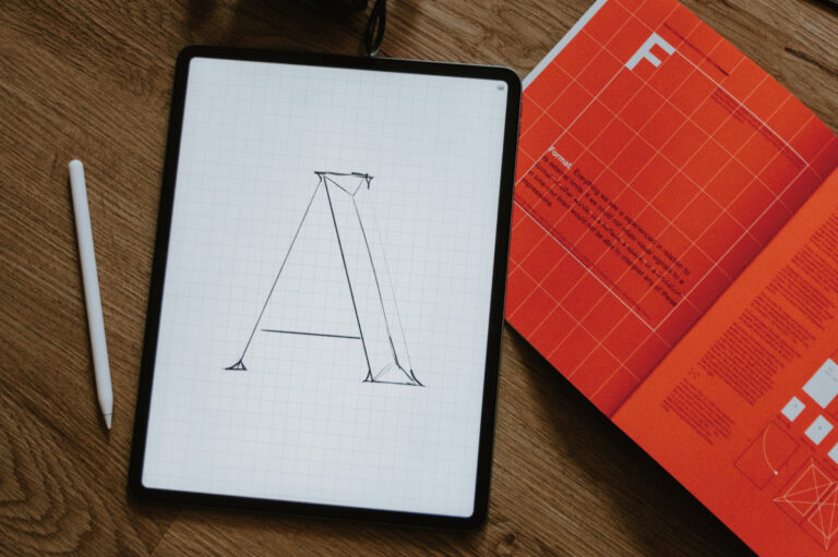
Fonts are ostensibly a choice of tools, but in reality they have always been a reflection of the collective state of a certain era.

Before and after 2026, the field has been going in two directions at once. One is toward a sense of craftsmanship, historical materials, imperfect textures, collages, inks, photocopier noise, and a deliberate attempt to show that "this is a trace of human production. The other is towards dynamism, technology, and instant response, where the font moves, breathes, and interacts with the user's behavior.
The road to craftsmanship.
I had a class on contemporary design trends in graduate school and needed to find a non-Taiwanese country to do research on. I thought about it and chose Poland because of Witcher 3 (my favorite). In the process of researching, I found Ola Niepsuj, a Warsaw-based designer and illustrator.
At the first sight, her works are interesting and relaxing with a sense of childishness.

She works with pencil, ink, scissors, and a photocopier. She copies the fonts from old magazines, old postcards, and second-hand books, enlarges them, and puts them back into the picture. Printing runs, inaccurate colors, and crooked alignment are not mistakes in her works, but the materials themselves. The source of the fonts is specific and has a history, and it is obvious where they were dug up from.
In addition to that, the way she handles humor. It's not intentionally funny, it's a self-deprecating and lighthearted attitude, mixed with serious composition and layout, which always makes you smile. (Maybe it's the Polish people's innate black humor, the plot of The Witcher 3 also has such a tone.)

charity partyposter for Japan, photo: courtesy of the artist (Copyright © Ola Niepsuj )
Ola Niepsuj designed it in the same way as what is now called theEphemera-inspired typography The trend highly overlaps.
Fonts should have a provenance, images should show the history of the material, and imperfections are part of the design, not flaws that need to be fixed.
Ephemera is a collection of print materials that are used and discarded, such as ticket stubs, flyers, old packages, and postcards. The designers started to mine these materials for inspiration for their fonts, and instead of using "vintage style" font simulations, they actually went out and found the original materials. Another designer, Vincent Howcutt, madeBrandingI went to an antique store and found old seed packages from the 1930s, and I also searched the British library collection to find my way around the original fonts.
The two approaches are not quite the same, but the direction is the same: the font has to have a provenance, and it can't just come out of thin air.
Behind this is a larger intention to deliberately introduce a sense of friction into the work: noise, scanned textures, typographical errors, handwritten irregularities. These things, originally seen as things to be fixed, are now part of the style.
In the history of art, there is always a reaction: what is popular in one generation, the next generation will always do the opposite.
Nowadays, technology has made the world we see more and more consistent, and human designers have expressed this with deliberate imperfections. It's like shouting, "This is what humans produce!"
Dynamic Fonts This Way
The key to this path of dynamic fonts lies in the use of Variable Font technology, which allows for the flexibility of continuous font changes. This trend emphasizes the interactivity of text, simulating breathability and physical momentum to enhance brand recognition in the digital environment.

The other side goes in a completely different direction.
The thrust of the technical surface is variable font.. One font file contains all the variations from small to bold, from narrow to wide. What used to take multiple static font files to do is now possible with a single file. It's only in the last few years that experimental options have gone from being an experimental option to being a regular tool in pioneer brands and large-scale recognition systems.
Fonts are flexible, not bouncing between a few presets, but a continuous axis. Want it a bit thicker than Regular but not as heavy as Bold? Just pull the slider to the center. What you couldn't do before is now basic. With program control, fonts can even change in real time with screen size or user interaction, but that's a matter for the development side, so the design side should just use the flexibility first. (This alone is much better than before!)
Practically used in brand design, COLLINS helped Bose to make a recognition system, extending the shape of the lever in the 1960's hand-drawn logo into a whole set of visual language, with a color system based on musical scales and dynamic behaviors, so that the typeface itself is visualized in the physical sense of sound, and Studio Dumbar helped OutSystems to make the Next Step campaign recognition, which rotates, cuts, and flows like a flag. The kinetic type is the backbone of the system, as the font rotates, cuts, and flows like a flag in motion. Both cases are not purely driven by variable font, variable font is one of the techniques to make the transition of font weights subtle and continuous, breaking the sense of disconnection between traditional font weights.
Another often overlooked benefit of variable fonts is at the system level. A brand can use the same font family to support its logo, headline, text, and dashboard, with different thicknesses and widths for different occasions, but the whole set of visuals is still unified. Fonts are no longer an independent choice, but a more flexible system.
When everything starts to grow the same.
AI has been generating more and more design content over the years, and the images are getting smoother, more flawless, more precise, and then more and more alike.
It looks good at first glance, but after looking at it for a long time you start to feel that every picture is pretty much the same, with no obvious flaws or distinct personalities.
Although the tool has become more useful and faster to generate, but if the use of the way or according to the previous habits, give a prompt, accept the first result, out of the model is the average value learned. It's not particularly bad, and it doesn't have its own style. After all, we have to find a way to get out of this predicament.
For example, I usually use boldface for most of my work.
The reason for this is that the presentation needs to be clearly visible, and black is stable, easy to read and error free; this is a reasonable and safe choice.
But if the entire visual language of the industry starts to converge in the same place for the sake of safety, that's another headache.
Font selection is a position
The handmade sense is to leave traces, while the dynamic font is to let the text interact with the user. They are different, but both are trying to solve the problem of homogenization and mediocrity in this era.
Of course, the choice of fonts is only a small aspect. For example, the interesting thing about Ola Niepsuj's work is not only her technique, but also the self-characteristics she expresses with her fonts and collages, which have both stance and humor, and it is obvious that they are made by a specific person. This "who-did-it" has become rarer than ever before at this point in time.
But honestly, I'm still trying to figure out what I can do to make myself more unique...it's a big question.