After working in the professional world for some time, returning to graduate school to study commercial design has been a process of reorganizing my knowledge. This space documents my notes from classroom learning and subsequent reflections. This article focuses on...Typography (also commonly translated as "字誌" in Chinese)Due to the unique characteristics of Chinese typesetting—such as the structure of square characters, stroke density, and vertical/horizontal layout—it presents distinct design challenges. This article will not delve deeply into those aspects. Instead, it primarily uses **Latin-based Typography** as an example to organize some fundamental concepts and applications. This serves as a reference for future use and is also shared with others who share an interest in design.
by Zping / Design Observation
Fundamental Principles and Applications of Typography
Typography is not merely about selecting a font; it is a comprehensive system concerning how text is read and perceived. It encompasses layout, spatial arrangement, emotional expression, and brand communication. Good design allows messages to flow naturally, while poor design becomes a barrier to reading.Poster DesignIn this context, typography and layout determine whether the audience will pause to read.UI/UXIn this context, character spacing and line spacing directly impact whether users can quickly grasp the operation.Brand DesignIn this context, font selection conveys a professional, approachable, or premium atmosphere. Ultimately, the core objective is simply:To communicate effectively。
The Basic Elements of Typography
During the design process, several fundamental elements form the core of the design presentation:
- Typeface: For example, Wenfeng and Wenfeng, which represent the concept of a font family.
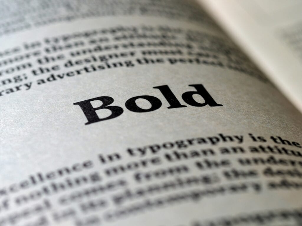
- Font: Bold, italic, underline, etc., primarily alters the visual appearance of text.
- Tracking: Adjusts the space between characters.
- Kerning (character spacing): Adjusts the space between specific characters. For example: AV, LY
- Leading (line spacing): The space between lines of text
- Negative space: The space between text and its surroundings guides the eye; margins should be excluded.
- Color
- …
These seemingly minor details can significantly impact the reading experience and design atmosphere of the text.

Figure 1. Font Anatomy
Characteristics of Different Font Types
- Sans SerifSans-serif fontClean, crisp, modern, and approachable, often used in digital interfaces.
- SerifSerif fonts): Conveys trustworthiness and tradition, solemn and professional, commonly seen in publishing and academic settings.
- ScriptHandwritten fontElegant, romantic, and personalized, ideal for invitation cards and brand logos.
- DisplayDisplay Font): Strong and bold personality, suitable for headlines and situations requiring intense attention-grabbing.
The choice of font depends on emotional expression and audience. Changing the font is essentially like adopting a different tone of voice.

Figure 2. Comparison Examples of Different Font Types
The Scope of Typography Applications
- PosterPoster DesignEffectively captures attention and conveys messages quickly.
- Magazine LayoutMagazines and PublishingControl the pace of reading and maintain a professional atmosphere.
- PackagingPackaging Design): Infuse brands with personality to enhance their distinctiveness.
- Architecture/Interior DesignArchitecture and Interior DesignAs part of the spatial wayfinding system.
- …
Opening your eyes to the world reveals traces of typography almost everywhere. It's not merely the arrangement of text, but a vehicle for conveying messages and atmospheres. From street advertisements to mobile screens, from café menus to subway route maps—all communicate through typefaces and layout.
<aside> <img src="”/icons/chat_gray.svg”" alt="”/icons/chat_gray.svg”" width="”40px”" />
Supplement: Typography in Front-End Frameworks Typography is also frequently encountered in front-end development, such asMUI或TailwindText styling tools provided. They focus on quickly applying headings, paragraphs, and font sizes while maintaining interface consistency. Emphasizing visual readability, they represent an approach to typography within the digital environment.
How can I further study typography?
To continuously improve your typography skills, observe and analyze various examples. The following resources are worth checking out:
- I Love TypographyFocused on typeface trends and history.
- Font in UseShowcase the real-world applications of the font.
- BehanceA global portfolio platform for designers.
- Letterform ArchiveA rich collection of fonts and typography resources.
By continuously comparing, deconstructing, and imitating, one can gradually develop their own sensitivity to typeface design.
Conclusion
Typography isn't just about how good a font looks; it actually conveys messages and emotions. Often, it's invisible, yet it determines whether content can be understood and whether it can move people. There's never been a single standard for typesetting. Different cultures, habits, and aesthetics naturally lead to different choices. For me, typography is about understanding myself—what styles I'm comfortable with—while also trying to understand others—whether they can grasp the message quickly. It's about finding balance between these two. No one starts out as an expert. It takes constant exposure, analysis, and practice, turning every project into fuel for the next.
Frequently Asked Questions
Q1: What is typography?
Typography is often translated as "the study of type and layout," though some refer to it as "the art of letters." If you look it up... typography meaning 或 typography meaningTypography refers to the art of type design and layout, utilizing fonts, kerning, line spacing, and white space to enhance readability while conveying emotion and brand messaging.
Q2: What is the difference between a typeface and a font?
A typeface refers to an entire font family, such as HuaKang, WenDing, or Source Han; while a font denotes a specific style within that family, such as "Times New Roman Bold."
Q3: In what situations should sans serif or serif fonts be used?
Sans Serif fonts are ideal for digital interfaces and modern designs; Serif fonts are commonly found in books, academic works, and formal publications, conveying a sense of dignity and tradition.
Q4: What is the method for learning typography?
Observe more case studies and analyze typeface applications. Write down what you like or dislike about others' designs, and build your sensitivity to type design through online resources like I Love Typography and Font in Use.