The following content is purely a personal experience sharing and does not represent the situation of all companies or teams. I hope these observations can provide UI/UX designers with another reference point for real-world collaboration.
User Experience/Interface Design as Most People Understand It
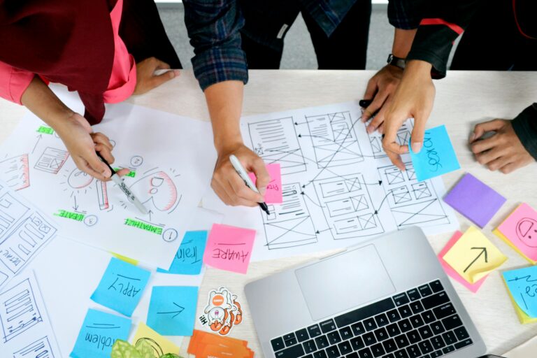
The primary responsibilities of UI/UX in the company include analyzing operational logic, verifying functional consistency, refining interface aesthetics, and ensuring the system looks usable and functions smoothly.
But over time, you'll discover that UI/UX work is more complex than you imagined.
Sometimes you need to explain logic to engineers, sometimes you have to help PMs visualize concepts, and sometimes you even have to make the boss understand that design draft that "feels like it could sell."
I used to think "user-centered design" was the starting point of design. It wasn't until I actually began working on UI/UX that I realized how easy it is to say, but how hard it is to do.
Most people assume that a designer's job is to "make things look pretty."
But the real challenge lies not in the visuals, but in "communication." When there is no clear logic, no consistent process, and no shared language,
The entire project is like a car with its navigation set to the wrong destination. The role of UI/UX is essentially to sit beside the driver and point out the direction, not to decide where the car should go.
What we can do is ensure the course doesn't stray too far off track.
User research? Or user guesswork?
The team talks about "user-centered design" every day. Ideally, we should conduct interviews, make observations, and distribute questionnaires. But the reality is we lack time, budget, and manpower.
Sometimes it's the sales team saying, "The client wants it simpler." Sometimes it's the manager saying, "This is more intuitive."
No data, no users, and no clear context.
Designers can only piece together outlines based on experience. After creating personas and user journey maps, they aim to help everyone understand the user flow.
The engineer glanced at it for a few seconds: "What is this? Way too complicated. We'll skip it for now."
At first, I was baffled, but the likely situation is this: It's not that people don't care about users—it's that no one knows how to "interpret" user research.
In theory, this is the very core of UCD (User-Centered Design): design should be driven by data and insights, not guesswork. But when time and resources are scarce, "research" often becomes nothing more than a slogan. Ultimately, design shifts from being "user-centered" to being "convenient for those doing the work."
The work of UI/UX design is stuck in this tricky and ambiguous gap.
PRD is a document; UI/UX is a translation of konnyaku.
The manager said, "The design must follow the PRD." But after opening the document, my headache only got worse.
Half of it is usable, half requires psychic abilities. The same project has three versions, each with different content.
You must determine for yourself which is the "current truth," then translate it into an interface that can be practically implemented.
Later I discovered that the PRD wasn't a manual at all—it was a language test.
Engineers, PMs, and designers— each department tells their own version, yet all assume the others should understand.

The ideal scenario would be for everyone to align their perspectives and reach consensus, but the reality feels more like a Tower of Babel. So daily work isn't just about visual and experience design—it's about confirming whether requirements are truly consistent.
UI/UX "design" often involves cross-departmental communication and translation. No matter how beautiful the design, if it fails to achieve its purpose, it's all just an illusion.
The design is fine, but the final image doesn't look like that.
Every time a project wraps up, I take a deep breath and brace myself— because the final product always turns out different.
Engineers know full well that Figma can't be directly converted into frontend code. But to keep the system running smoothly and prevent code from exploding, they often "make their own adjustments" during implementation. That "adjustment" is usually where design breakdown begins.
Character spacing, buttons, and navigation paths—each was replaced with "the version that could run in the system."
The rhythm in the design draft was altered, and the proportions were compressed. The final image is still usable, but it's no longer the original design.
The engineering lead later remarked, "Your designs weren't flawed—it's just that the engineers couldn't build them." This wasn't consolation, but reality. Design systems, component libraries, handoff documents, etc., can indeed reduce discrepancies. But they address style consistency, not "understanding consistency."
Later, he also admitted that he hoped for a platform that could directly convert Figma files into code while maintaining compatibility with existing frameworks without breaking them.
In fact, both sides are doing the same thing: striving to make the visuals and logic align with reality, though they're wrestling with it in different ways.
Finally, both parties will coordinate to find a mutually acceptable approach to complete that system project. The interface won't look exactly as originally envisioned, but at least it will be functional, operational, and usable.
Sometimes, this is already the greatest consensus.
The work of UI/UX design is about finding balance within these gaps. It's not just about designing screens—it's about designing a reality where coexistence is possible.
Work through the chaos, but never lose sight of your direction.
The gap between design and engineering is like version control.
We're always chasing synchronization, yet delays will always exist. I don't blame anyone; it's just that no one has ever truly defined what "right" means.
This is simply meant to document situations designers frequently encounter in real-world projects. Similar scenarios have happened to nearly every designer, just with different scripts.
The role of a designer may not be to solve every problem, but to make problems visible— sometimes that is enough.
Ideals are rich and full, but reality is lean and bony. And that's precisely why we keep asking: "Does this really work?"
Because that question is the starting point of design.
Whether something is effective or not requires designers, engineers, and users to define it together. Through continuous communication and refinement, design serves as a bridge—letting the team hear the user's voice while ensuring the team's efforts are understood by the user.
This may well be the greatest value of design.
If you're considering moving from being a corporate designer to taking on projects on your own, learn aboutBrand Recognition FeeThe first step in building confidence in pricing is the market.
💬Questions for you
Do you believe the value of design lies in helping users understand the system, or in helping the system understand people? If neither side understands, can we still call it "user-centered"?
#UIUX # Design Daily # Project Management # Design Thinking # Design Workplace # Product Design # Workplace Insights